Buttons
A button is a graphical user interface element that performs an action when clicked or pressed by the user. Buttons can be used to initiate a process, submit a form, navigate to a new page or section, or trigger any other action in the application.
Buttons can appear in various styles and sizes, but they typically include a label that describes the action that will be performed when the button is clicked. The label is often displayed on the face of the button, and it may be accompanied by an icon or other graphical element that provides additional context.
Buttons Usage
Buttons communicate action area for user.
They are typically placed throughout the UI, in places like : Dialogs, Forms, Toolbars, etc.
These buttons trigger an ink reaction on press.
They may display text, imagery, or both.
Flat buttons and raised buttons are the most commonly used types.
Button legal are key elements of it, as using the wrong label can cause users confusion, loss of time, and possibly some big mistakes.
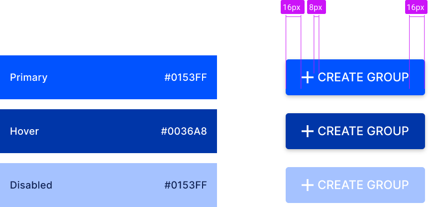
Button States
Primary Button
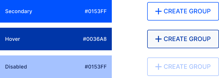
Secondary Button
Tertiary Button
Text Button
Link
Link Hover
Tabs / Sub Tabs