Filters
Filter Usage
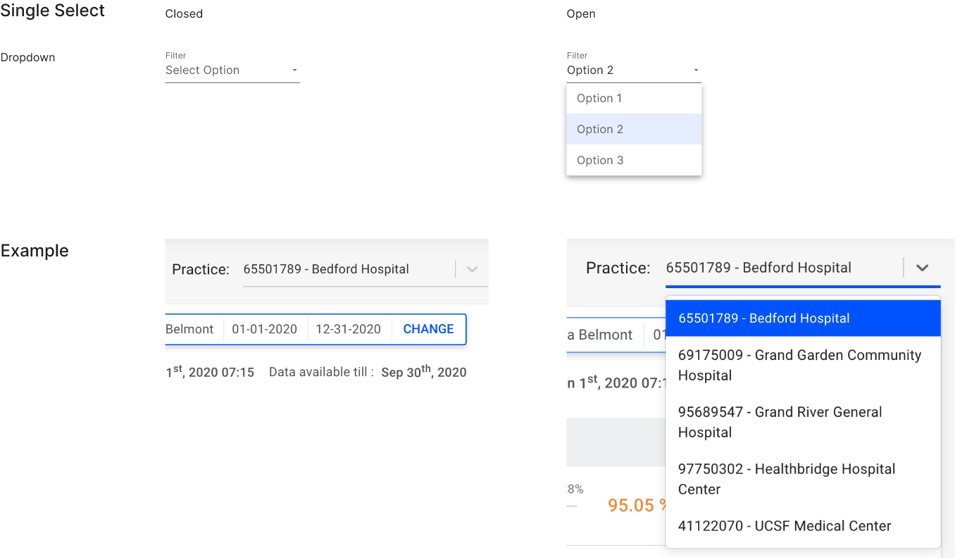
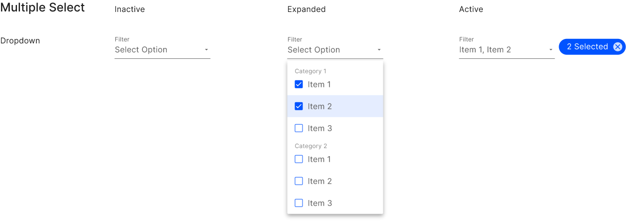
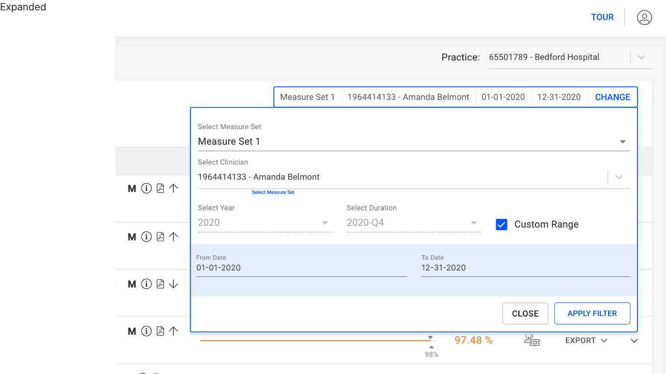
Filters are graphical user interface elements that allow the user to refine or narrow down a set of data or content based on specific criteria or parameters. Filters typically consist of a set of options or checkboxes that the user can select to specify their preferences.
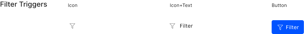
Filters can be designed in different styles, with different sizes, shapes, and colors. They can also have different labels or icons to indicate the type of data or content being filtered.
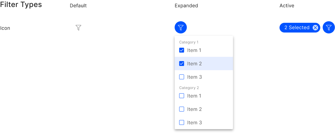
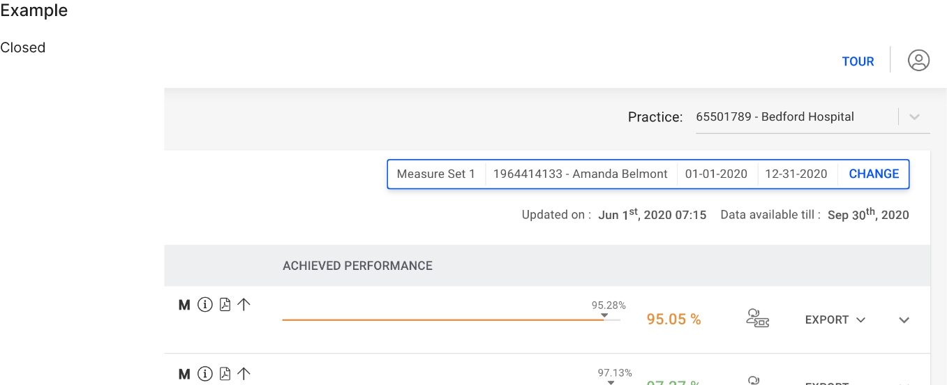
When user filters the data from the given options, number of selected options will be shown on UI. Use filled chips to keep user aware about the active filters.
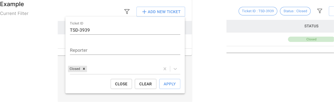
Use interactive chip, to allow users clear the filter criteria without any hassle.
Position chip on left/right to the trigger point (button, icon etc.) as per the necessity.
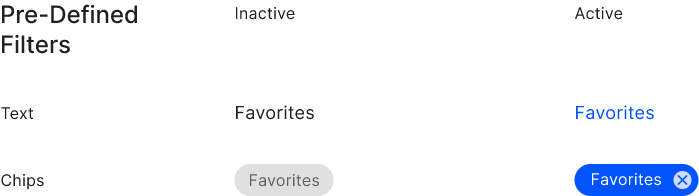
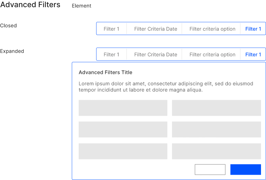
Use primary colours to indicate active status of the filters. Toggle Active/Inactive states, is the only action user can do with this filters.
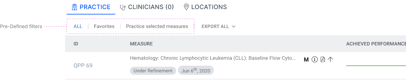
Example
Checkbox