Primary Color
Blue
#0153FF
Color is a critical component that sets our brand apart and enables us to provide a consistent experience across all our products.
By utilizing color effectively, we can enhance the visual communication of our products and create an immediate impact on our users. As an important tool for communication, color helps users process information quickly and efficiently, enabling us to deliver a seamless and intuitive user experience.
Contrast
Contrast and color use are vital to accessibility. Users, including users with visual disabilities, must be able to perceive content on the page. In the next phase targeting to achieve WCAG 2.1 compliant contrast ratios.
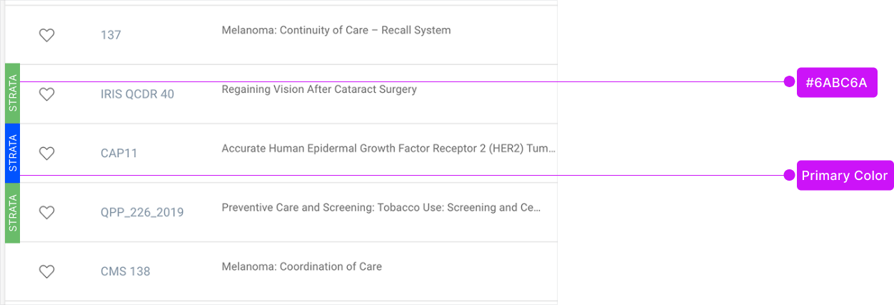
Primary Color
Blue
#0153FF
Secondary Colors
Medium Blue
#01A4FF
Light Blue
#E5EDFF
Dark Blue
#122455
Light Blue 1
#C1DAEE
Dark Grey
#333333
Grey
#4D555B
Light Grey 1
#A6ABAD
Light Grey 2
#E6E6E6
Light Grey 3
#F4F4F4
Light Grey 4
#F8F7F4
Orange
#F09A1C
Red
#E8594F
Green
#6ABC6A
Other Colors
Purple
#7C33FF
Green Light
#1ADFAC
Yellow
#E9F200
Colors in action