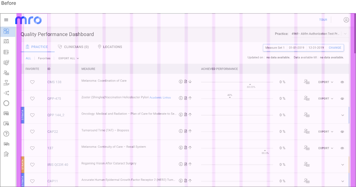
Grid
Baseline grid
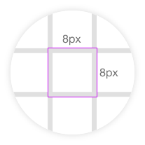
A baseline grid is a dense grid of equally spaced horizontal lines that determine where text will sit. Baseline grids are often used in combination with column grids, to make sure that the lines of text in each column align uniformly across a spread. In our grid system, we are considering base unit of 8*8px. In some cases where furthermore detailed grids are required, we will use base unit of 2*2px.
Important Pillars of the GRID System
The grid system is further divided into following sub parts
- Columns
- Margins
- Padding
- Gutters
- Breakpoints
Columns
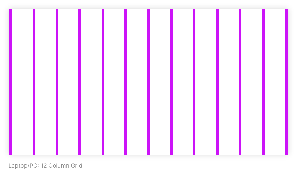
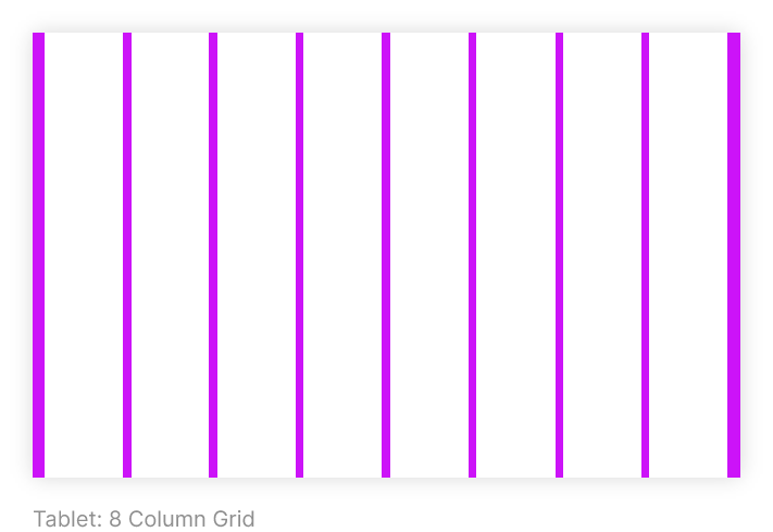
Column width is defined using percentages, rather than fixed values, to allow content to flexibly adapt to any screen size. The number of columns displayed in the grid is determined by the device on which a screen is viewed, whether it’s a mobile, tablet, or another size.
- Laptop/PC : 12 Column Grid
- Tablet : 8 Column Grid
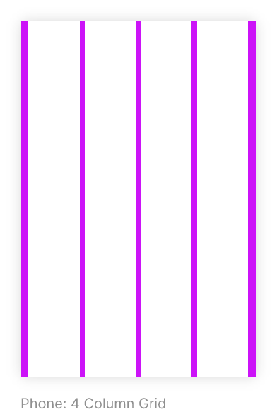
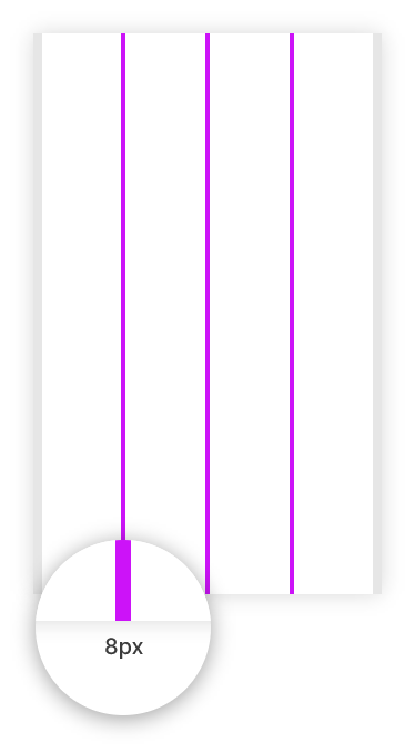
- Phone : 4 Column Grid
Margins
Column width is defined using percentages, rather than fixed values, to allow content to flexibly adapt to any screen size. The number of columns displayed in the grid is determined by the device on which a screen is viewed, whether it’s a mobile, tablet, or another size.
- Margins are the space between content and the left and right edges of the screen.
- Margin widths are defined as fixed values at each breakpoint range.
- To better adapt to the screen, the margin width can be different at different breakpoints.
- Margins use a fixed value for each breakpoint.
- Wider margins are more appropriate for larger screens, as they create more whitespace around the perimeter of content.
Margins-Special Cases
In some specific cases, margin values can be different from the defined values, to achieve better content management and readability. A type of content can also be the reason behind unspecified margin (e.g. Video/image, paper layouts etc.)

Gutters
Gutter space is the space between two columns. This space is necessary to separate the content displayed on the screen.
To manage the space, the gutter space can be different for different screen size/devices. Although they are different, it has to be in the multiples of 8 (e.g., 8px, 16px, 24px etc.) as we are using base grid of 8 pixels.
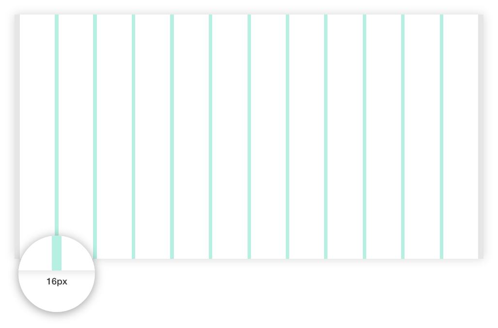
Gutter spaces have fixed values up to the breakpoints. But the values are not flexible as the column widths.
Determine the gutter space value considering type of data being displayed on the screen (card layout and paragraphs of text may need different gutter space).
Wider gutters are more appropriate for larger screens, as they create more whitespace between columns.
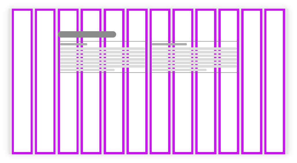
Padding
An Element’s padding is the space between the content and the border of that element.
Padding can be added to columns,
- To define space between component’s border and the content inside the component.
- To completely avoid adding the gutter spaces, and manage that space with the help of paddings. In this case, If we need 16px of space between content, then we have to add 8px of padding. As it will be applicable to both the adjacent columns and it will be added up to 16px.

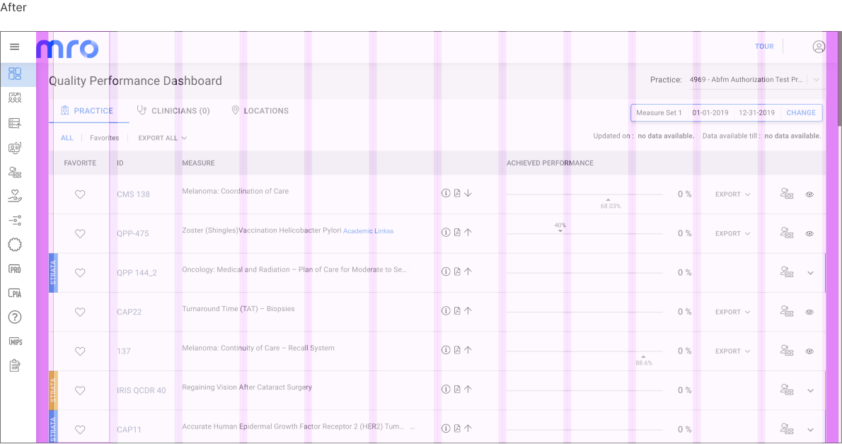
GRID System and Sub-Components
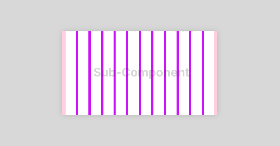
When there is sub-component, It has its own Grid system at component level.
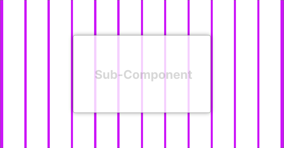
Don’t use primary GRID to group and align content inside sub-component
Images