Cards
A card is a graphical user interface element that displays information or content in a self-contained and visually appealing way. Cards are often used to display information about products, articles, or other content in a consistent and easily digestible format.
Cards can be designed in different styles, with different sizes, shapes, and colors. They can also include interactive elements, such as buttons or links, to allow the user to take action or learn more about the content.
Cards Guidelines
- Limit content
- Differentiate actions
- Add visual hierarchy
- Resist excessive borders
- Limit links. Upfront Action Items
- One Thought/idea per card
- Know when to use a list
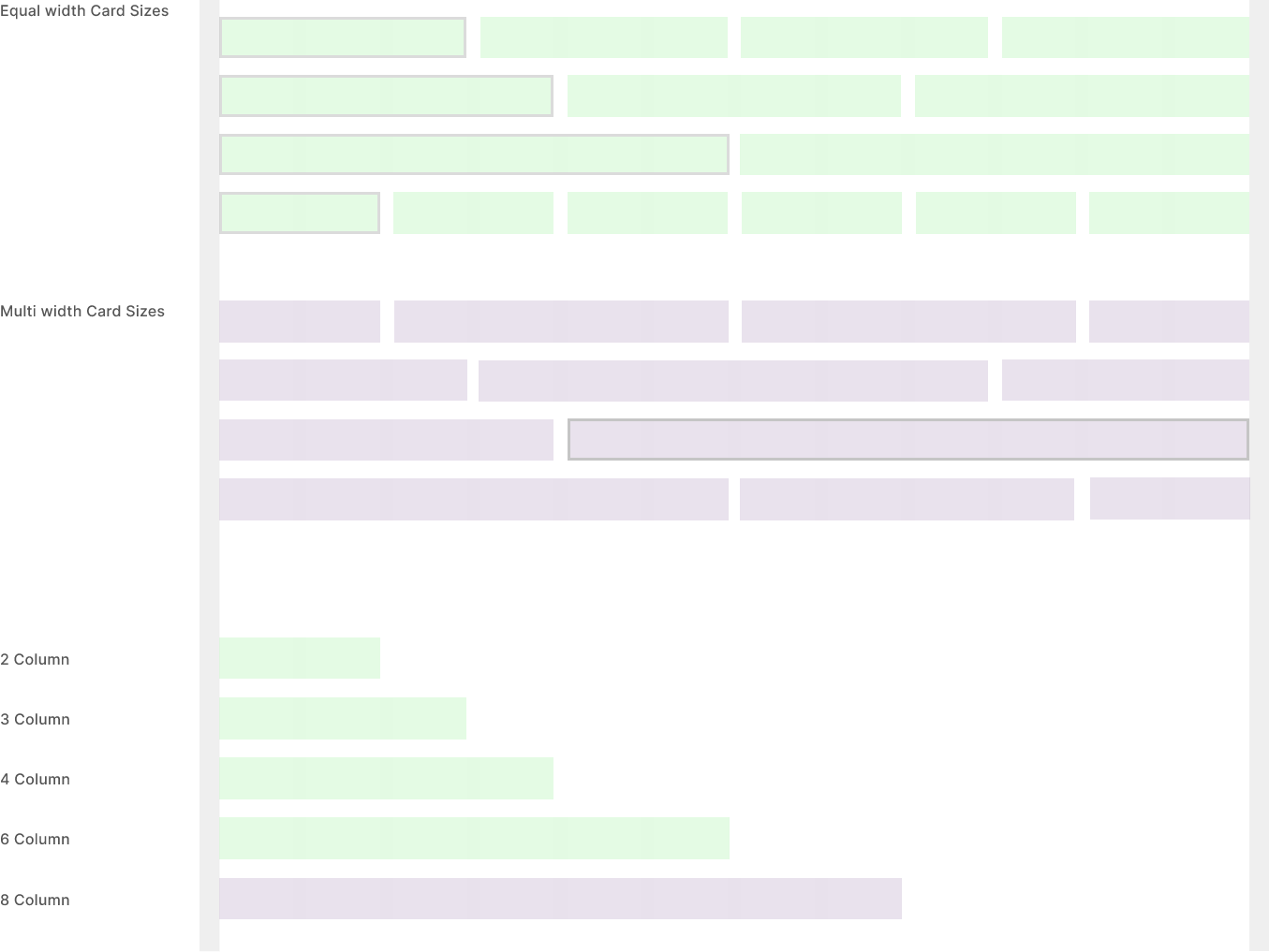
Card Sizes
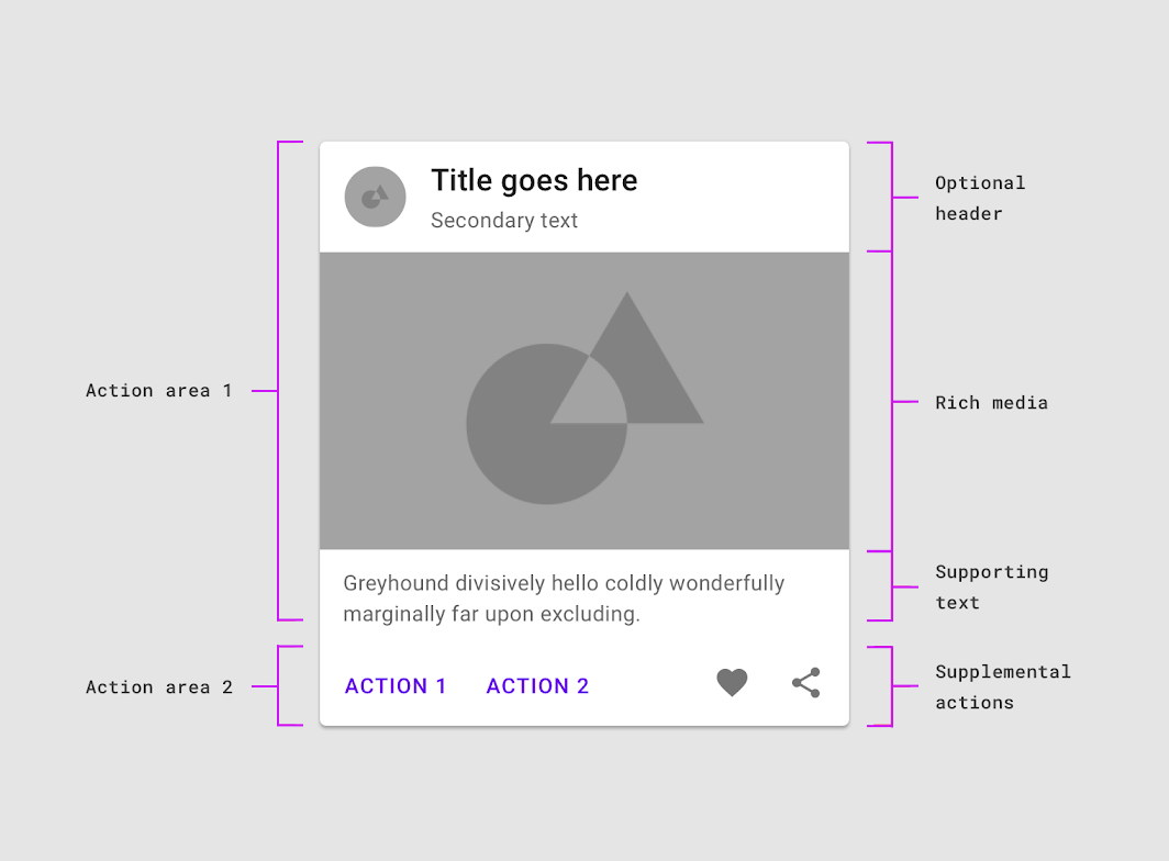
Card Elements
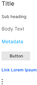
Card Type 1
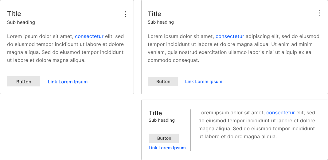
Card Type 2
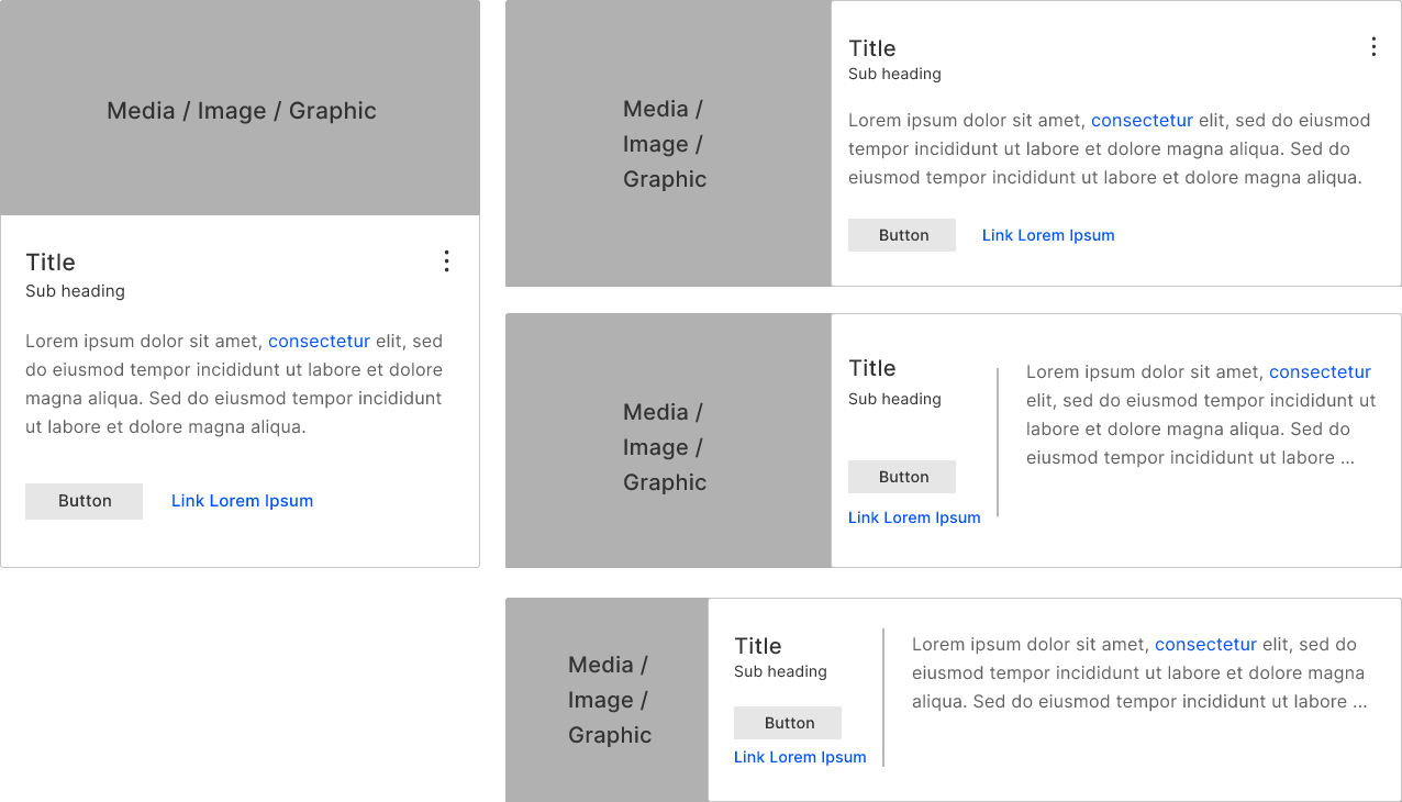
Card Type 3 Labels & Tags
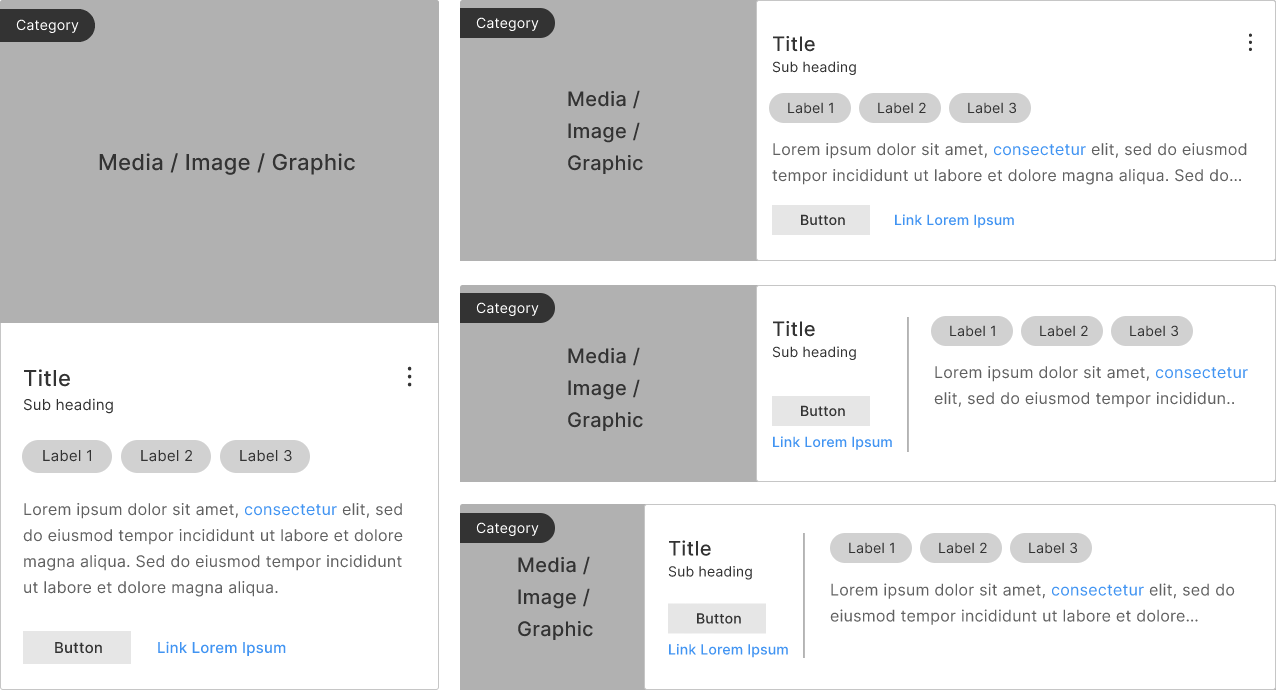
Card Type 4 Small Card
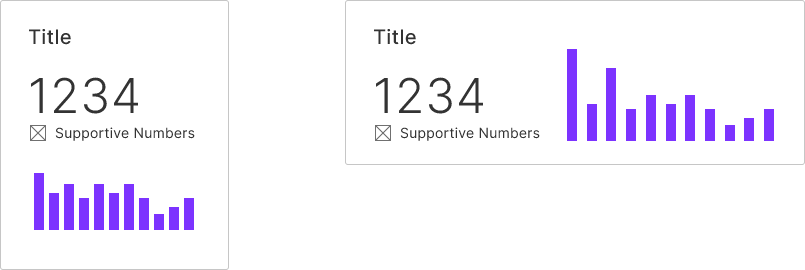
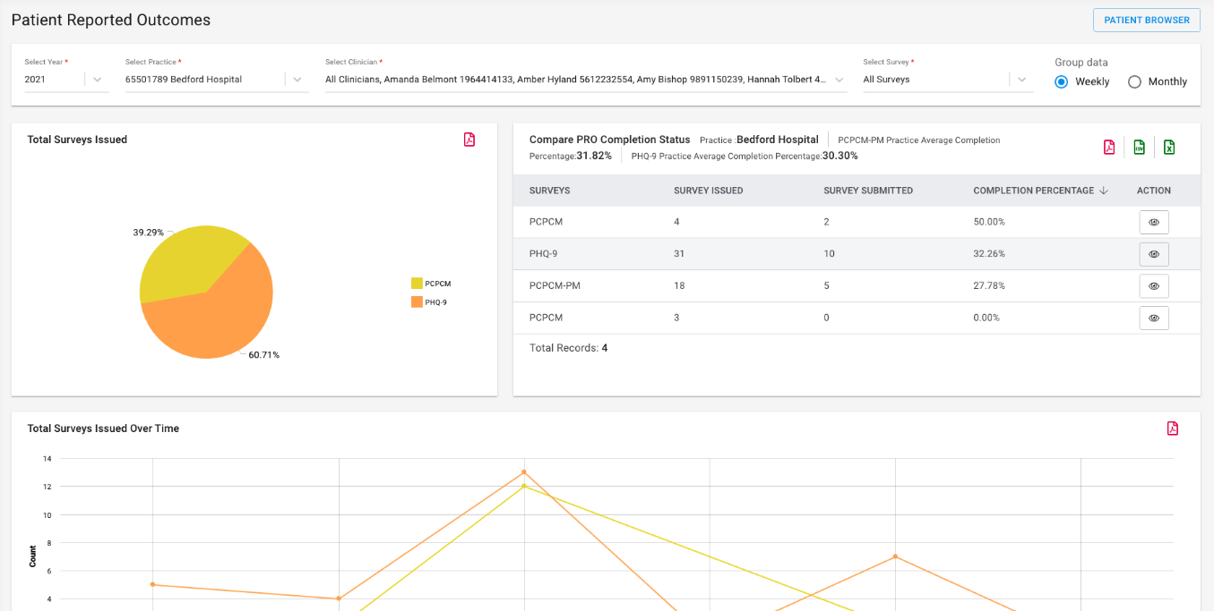
Next
Popup Model Window
Popup Model Window